This week we have released a few updates that focus on usability of the ScreenSteps extension and user reporting.
Improved design
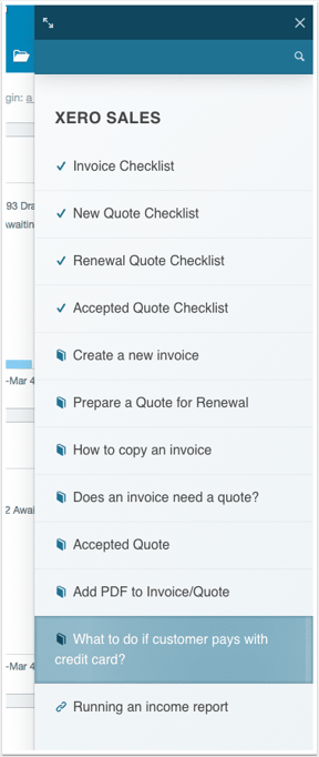
In this update we wanted to make the extension easier to use as well as make it clearer which type of resource you would be viewing. We made the following improvements:
- Improved search bar
- Icons for resource types (Checklist, Article, and URL)
- Lighter background for article content.
Widget expansion
Having the widget appear in the sidebar is great. But sometimes you need to see more content. This latest update allows you to expand the widget out into a wider view in your browser window.
User Group reporting
In a previous update we allowed you to add users to groups. In this latest update we have added user group filtering to reports. This means you can see which articles "Accounting" is viewing vs. your sales team. User group filtering is available for both Views and Checklist completion reports.
Moving the bell...
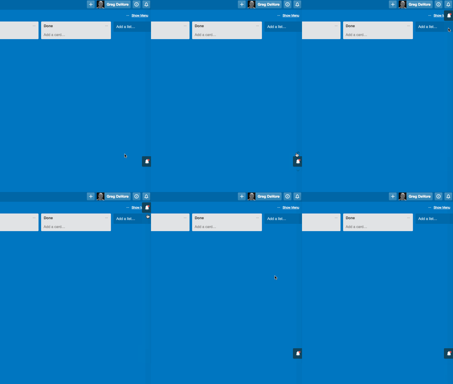
Sometimes the ScreenSteps "bell" would cover areas of the page. This latest update allows you to quickly move the bell to the top, middle or bottom of the page.

What's next?
Over this next week we will be working on providing a knowledge base website as part of your ScreenSteps account. This will allow you to provide contextual resources but also send your employees to a searchable company knowledge base.
If you are interested in getting set up with a demo of an ScreenSteps account then please get in touch and we will get you going.


